Page 1 :
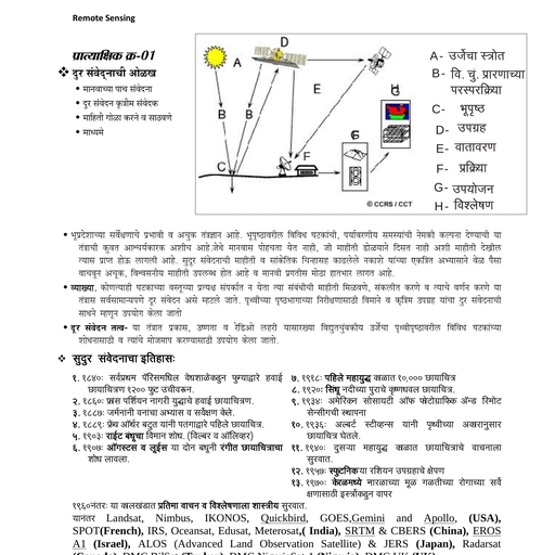
101, , Unit -5, READING OF THEMATIC MAPS, CARTOGRAPHIC TECHNIQUES, NEED OF CARTOGRAPHIC TECHNIQUES :, Introduction We deal with the different types of quantitative data every day e.g., Time, Distance, Weight, Temperature, Rainfall, Price, Discount,, Attendance %, Marks in the examination etc., Similarly lot of statistical or Quantitative data is used for various, purposes like administration, planning etc., Many of us have fear about mathematics and hence they are, reluctant to pay attention to the numbers., Cartographic Techniques help us to present numerical information /, Quantitative information in the attractive form - i.e. in the form of a, diagram. We hate to take medicine in the form of bitter powder but, we take the same bitter medicine (powder) easily in the form of a, capsule - because capsule looks very attractive., CARTOGRAPHIC TECHNIQUES, Located Bars, Isopleth map, located Circles, Choropleth Map, Pie chart, Dot Map, Flow Map, Pictogram, ADVANTAGES, The advantages of the cartographic techniques are as follows :, Graphical Form Cartographic techniques like bars, circles, pie charts have specific, attractive graphical forms :
Page 2 :
102, Diagrams are proportional to the Quantity which they, represent :, We do not write numbers proportional to the quantity which, they represent. e.g. Number 1 (one) and number 9 (nine). In this, case we dot not write number Nine-9 times larger than number one., Hence the difference between 1 and 9 may not be very distinct. But, if we represent these numbers with the help of bars, then we find, that bar for number 9 is nine times bigger than the bar of number 1., , Hence even a illiterate person can easily understand, difference between number one and number nine with the help of, cartographic technique (bar)., Attractive colours and shades can be used for the cartographic, techniques We are fond of colours. We prefer colour T.V. than the black, and white T.V. Girls apply bright colured lipsticks to look very, attractive. Similarly colourful cartographic techniques attract our, attention and serve our purpose of conveying statistical information, easily to the reader., Isolated from text Diagrams and maps are generally isolated from the text., These are drawn within a frame - mostly rectangular. Hence they, are not mixed with the text matter. Statistical data or numbers, written along with the text are not highlighted or attract our, attention. On the other hand diagrams or maps drawn within frame, attract our attention. Even the blank space within the framework of, diagram or map help us to focus our attention on the map or the, cartographic techniques e.g. Leader who is giving his speech from, the stage attracts more attention than the leader standing in the, crowd., Pictoral form The process of learning starts with the help of pictures e.g., ‘A’ for apple. Similarly picture or line sketch of female on railway
Page 3 :
103, compartment or toilet becomes more effective than the written, words. There are many languages in this world and hence if you, know particular language only then you can read that word and, understand its meaning, but language of picture is understood by, anyone in this world. Illiterate or literate, young or old., ‘I Love You’, You can understand this message only if you know English, In pictogram - one of the cartographic technique - we use, appropriate pictures to represent our data e.g. picture of tree to, represent forest, Atomic reactor for atomic power stations, or, human being for population., Logical Reasoning In the different cartographic techniques some kind of logical, reasoning is used in each technique. e.g. Bar is a linear diagram,, where length of bar is proportional to the quantity it represents., In circle diagram area of the circle is drawn proportional to the, quantity it represents., , CARTOGRAHIC TECHNIQUES, Located Bars :, Bar is a linear diagram, which means the length of bar is drawn, proportional to its length., When bar is placed on the map at proper location it is termed as, located bar. It is necessary to compare bar with the key provided in, the map to know its actual or approximate value. i.e. if length of the, bar drawn on the map is same as the bar represented in the key, then we get exact value of the bar, but the length of bar is between, two values of the bars represented in the key, then we get, approximate value.
Page 4 :
104, , Bar can be drawn in vertical or horizontal direction but width of all, bars should remain same., Bars are drawn to represent population, industrial production, crop, production, mineral production, rainfall etc.
Page 5 :
105, Located Circles :, Circle is a areal diagram, which means area of the circle is, drawn proportional to the quantity it represents. Hence circles are, used for the data which has greater range - (i.e. difference between, the lower and higher value.) When circle is drawn on the map at, proper location it is termed as located circle. We can compare size, of the circle drawn on the map with the circle drawn in the key by, comparing their diameters., Circles are drawn to represent population, crop production or, the production of various commodities.
Page 6 :
106, Divided Circles :, Divided circles help us to represent sub-divisions in the, quantity represented e.g. Different sources of power are generated, at a particular place. e.g. hydel, thermal and atomic. This variation, can be represented with the help of divided circles. In this case size, of the circle will represent total amount of power generated at a, particular place and each sector of the circle will be drawn, proportional to the production of particular type of power i.e. hydel, or thermal etc. It is assumed that the total amount of power, generated is equal to the total degrees of the circle i.e. 360 and so, each segment or sector representing subdivision will be drawn, proportionately., Divided circles or Pie diagram : Example 2, Subdivisions in the data can be represented effectively with, the help of divided circles or pie diagram. Circle can be divided into, 3600 and hence the total quantity is assumed to be 3600 and the, subdivisions are represented as segments of the circle for which, the angle of the segment is proportional to the quantity of the, subdivision.
Page 7 :
107, , Isopleth and Choropleth In both these cartographic techniques line shades are used, to represent data. Darker shade represents higher density & lighter, shade represents lower density.
Page 8 :
108, Choropleth Map :, ‘Choro’ means Region and ‘Pleth’ means density. Hence, choropleth map is a map which represents density distribution, within the various regions or administrative units., Government collects statistical data from the people every, 10 years through ‘Census’ operations. Hence lot of information /, data is available - village wise, talukawise, districtwise, statewise,, and countriwise. This information can be effectively represented by, choropleth map., In order to bring out variation within data, it is divided into 4-5, classes. Line shades are used to represent these classes. Darker, shade is used for high density and lighter shade is used for low, density., , Key
Page 9 :
109, , Isopleth Map :, Iso means equal and pleth means density. Hence Isopleth, map represents data with the help of Iso lines i.e. the lines of equal, value. In order to bring out variation in the data, area between, isolines is covered by line shades. Darker shade is used to, represent higher density and lighter shade is used to represent, lower density. Similar to the shades used in the choropleth map., Data of natural elements like temperature, rainfall,, atmospheric pressure etc. has no relation with the administrative, boundaries or administrative units. Hence in Isopleth map, administrative boundaries are avoided and data related to natural
Page 10 :
110, features like temperature, rainfall, atmosphere pressure etc. is, represented with the help of isolines., Temperature values at different locations., Isolines of 20c and 30c, Selection of shades Darker shade for areas having higher, temperature ( 30c ), , Temperature, , Lighter shade for the areas having lower temperature (< 200c )
Page 11 :
111, , DOT MAP, A Map in which ‘dots’ are used to represent distribution is, known as Dot Map. It is one of the density maps. It is easy to draw, and simple to understand., Dot plays key role in the Dot Map and hence it is necessary, to remember., Size of dot - It should not be too large or it should not be too small., Size of dot is determined accordingly to the size of the map and, value of the dot.
Page 12 :
112, Value of dot - Each dot has specific value in the Dot Map and, hence value of dot is carefully decided on the basis of size of the, map and size of the dot., Placement of the dots - Earth’s surface is not even. Some areas, are suitable for man while other areas are not. Relief & other, factors are considered for the proper placement of the dots.
Page 13 :
113, Flow map Arrow indicates direction of movement. Hence flow line, indicates movement of population or material from one place to, another., Width of the line or thickness of the flow line represents, quantity carried from one place to another., Areas of production and the areas of consumption are not, same every where. Hence material is transported from one place to, another. This interaction between two places can be represented, by the flow map more effectively. In this map flow line is drawn, between two places and width of the line is drawn proportional to, the quantity of the material transferred from one place to another., Flow map is also used to represent migration of people from one, place to another., , In the above diagram place is connected to the places C and D The, amount of material transported from to other places is as follows., From, A, A, A, , To, B, C, D, , Material transported (in Thousand tones), 20, 10, 50, , In order to represent this data we will have to select suitable, scale i.e., 5 m.m. for 50 thousand tonnes., 2 m.m. for 20 thousand tonnes., 1 m.m. for 10 thousand tonnes.
Page 14 :
114, , Pictogram The ultimate goal of any map is to convey information, effectively and attractively to the reader., , Pictures are very effective in communicating information. All, people young or old like pictures and hence information or data is, represented effectively with the help of pictures, in Pictogram. e.g., Forest Population
Page 15 :
115, There are two methods of drawing pictograms :, a) Size of the symbols remains same in this method small size, symbols / pictures are used., Each symbol / picture has specific, value e.g. one picture of man represents 10,000 persons and so in, order to represents population of 50,000 persons we will have to, draw 5 pictures., b) Variable size of the pictures - In this method size of the picture i.e. height of the picture - is drawn proportionately to the quantity, which it represents.
Page 16 :
116, Tips for solving questions related to the Cartographic Techniques., LOCATED BARS, How to solve questions related to the located bars?, Take a piece of paper or you can use edge of your question paper., Keep this paper near to the bar and mark height of the bar on the, paper with the help of pencil marks. (Fig. 1), Pencil, marks, Key, Production in, thousand tonnes, - 100, - 80, - 50, , Paper Strip, Figure 1, Now shift paper near to the key of the map. If height of the bar, perfectly matches with the height of the bar in the key then you can, mention exact value of the bar. (Fig.2), Pencil marks on the strip match with the bar in the key and hence, we can mention exact value as production 100 thousand tonnes., , Key, Production in, thousand tonnes, - 100, - 80, - 50, , Paper Strip, Figure 2
Page 17 :
117, , Key production in, Thousand tonnes, - 100, - 80, - 50, , Pencil marks on the strip do not match with the bar in the key, and hence we can not mention exact value so our answer is, production is between 80 to 100 thousand tonnes., Figure 3, But if it is in between two bars in the key, then mention lower, and upper values represented in the key. (Fig. 3), Same technique can be used for the located circles map and, flow diagram., In the case of located circles mark the diameter of the circle, on the strip of paper with the help of pencil marks and compare it, with the key given in the map., , Pencil marks, , Key, Population, In million, 50, 25, , Figure. 4
Page 18 :
118, , Key, Population in Million, 50, 25, , Pencil marks, In this case diameter of the circle is between ‘25’ and ‘50’ so, our answer is Population of the city is between 25 to 50 million., Figure 5, In the case of flow map mark width of the flow on the strip of paper, and compare it with key, given in the map., ADDITIONAL EXERCISES - CARTOGRAPHIC TECHNIQUES, 1) Study the world map given below and answer the following, questions., , What is the theme of the map?, Which cartographic technique is used to represent the theme?, Which country in the South Hemisphere show highest range of, GNP?, What is the range of GNP hi major part of Australia?
Page 19 :
119, Identity country in the northern hemisphere, having GNP ranging, between 20% and 62%., 2) Study the world map given below and answer the following, questions. (5), , What is the theme of the map?, Which cartographic technique is used to represent the theme?, What is the total quantity of iron produced in USA?, What is the total quantity of iron produced by Europe as per this, map?, What is the total production of iron by India?, 3) Study the world map given below and answer the following, questions. (5), What is the theme of the map?, Name the cartographic technique used in this map., State the amount of foreign debt of Mexico, India and Hongkong.
Page 20 :
120, 4) Study the world map printed below and answer the following, questions. (5), , What is the theme of the map?, Name the cartographic technique used to represent the theme., Name the countries having the least and maximum gross national, income per capita 2007., With the help of the scale find out gross national income per capita, of South American countries?, 5) Study the world map printed below and answer the following, questions. (5), , What is the theme of the map?, Which cartographic technique is used to represent the theme?, With the help of the scale, find out the percentage of population, between the age group of 15-64 years in Argentina., With the help of the scale find out the percentage of senior citizens, in North-American countries., State the composition of ‘Age Structure’ in India.
Page 21 :
121, SECTION - II WORLD MAP, Colour maps given in this Section as per the instructions, SECTION - II WORLD MAP
Page 22 :
122
Page 23 :
123
Page 24 :
124
Page 25 :
125
Page 26 :
126
Page 27 :
127
Page 28 :
128
Page 29 :
129, Selected Countries in the World Canada, U.S.A., Mexico, Brazil, Argentina, Chile, U.K., France, Spain, Portugal, Germany, Poland, Switzerland, Italy, Norway, Sweden, Finland, Russia, China, Japan, India, Sri Lanka, Nepal, Bangladesh, Pakistan, Malaysia, Singapore, Indonesia, Australia, Iran, Iraq, Saudi Arabia, Egypt, Nigeria, Sudan, Ethiopia, Kenya, Tanzania, South Africa
Page 30 :
130
Page 31 :
131
Page 32 :
132, Exercise, Environmentally Significant Features., Mark and Name following features in the map of the world., PHYSICAL FEATURES, 1., 2., 3., 4., 5., 6., 7., 8., 9., 10., 11., 12., 13., 14., 15., 16., 17., 18., 19., 20., 21., 22., 23., 24., , Major ocean to the south of India. (Indian Ocean), Continent in the southern hemisphere, which is covered by, snow (Antaractica), Eathquake prone area in the northern part of India (Himalaya), Largest continent in the world (Asia), Desert in South America (Atacama), Continent, which is near to the South Pole and is uninhabited, (Antarctica), Major island near North America. (Greenland), Drought affected country in Africa (Ethiopia), Largest ocean in the world (Pacific), Major flood affected country to the east of India (Bangladesh), Largest desert in the world (Sahara), Earthquake prone area near Pacific Ocean (Circum Pacific, Belt), Smallest continent in the world. (Australia), Major flood affected country to the west of India. (Pakistan), Major mountain range in the South America (Andes), Desert area in southern part of Africa (Kalhari), Country having largest oil reserves Arabia), (Saudi Major flood affected country to the north of Sri Lanka., (India), Earthquake prone area to the north of Mediterranean Sea, (Alps.), Mountain range to the north of India (Himalaya), Major mountain range in the Western part of N. America., (Rocky mountains), Major mountain range in the eastern part of N. America, (Appalachian), The canal which separates two continents. (Suez Canal), Major mountain range in Austrialia (Great Dividing Range)
Page 33 :
133, , HUMAN (CULTURAL) OR ANTHROPOGENIC FEATURES, 1., , New York to London air route., , 2., , Singapre to London air route., , 3., , Major canal which is situated between two major continents., (Suez Canal), , 4., , An international port to the South of India (Colombo), , 5., , An international post which is near to the Equator. (Singapore), , 6., , Area in North America affected by Acid Rain. (N.E. part of, U.S.A.)
Page 34 :
134, 7., , Major producer of nuclear power in Asia, , (Japan), , 8., , A canal, which connects two oceans (Panama Canal), , 9., , Longest railway route in the world. (Trans-siberian railway, from Leningrad to Vladivostok), , 10. Buenos Aires to Cape Town air route, 11. Area affected by Acid Rain to the east of China (Japan), 12. Country having largest population in the world., 13. Asian country affected by Acid Rain (Japan), 14. New York to Mumbai air route., 15. Region in Europe affected by Acid Rain (N.W. Europe), 16. City in India, which was affected by worst gas disaster, (Bhopal), 17. Cape town to Colombo air route., 18. The longest ship canal (Suez 16.9 Km), 19. Delhi to Tokyo air route., 20. Mumbai to Moscow air route., 21. Delhi to Canbera air route., 22. Washington D.C. to Paris air route., 23. Delhi to London air route., 24. Cairo to Hongkong air route., 25. New York to Moscow air route., 26. San Francisco to New York ship route., , ADDITIONAL EXERCISES MAP OF THE WORLD, 1) Mark and Name the following on the outline Map of the World :, (5), An ‘earthquake’ prone island in Far-East Asia., Part of India with economic water scarcity., A country in Africa with very high Deforestation rate., A sea experiencing oil spill., An European country facing problem of ‘Acid rain’., 2) Mark and name the following features on the outline map of, world provided to you :, (5), A country with highest deforestation rate in South America., An area rich in biodiversity in India., An area in North America having physical water scarcity.
Page 35 :
135, A Gulf in the West Asia having problems of oil spill., An earthquake prone island country in far East Asia., 3) Mark and Name the following in the outline Map of the World:, (5), Mumbai to London water way, Panama Canal, Industrial area in the USA, Worlds largest producer of rubber, Amazon basin, 4) Mark and Name the following on the outline Map of the World:, (5), Suez Canal, Equatorial forest in South America., Mumbai to Moscow air route, Alps mountain, Leading fishing bank in North Sea
Page 36 :
136
Page 37 :
137
Page 38 :
138, ,
Page 39 :
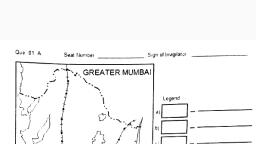
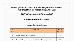
139, Environmental Studies- Semester I, Duration: 03 Hours, , Marks: 100, , Notice: 1) all questions are compulsory and carry equal marks, 2) Use of map stencils and simple calculator is allowed., 3) Attach the given maps along with your answer book., Q.1. (a) Read the world thematic nap and answer the question of, following, (10), i. What is the theme of the map?, ii. Describe the Cartographic technique used in the map, iii. Which country has the highest Gross National Income Per, Capita in 2015?, iv. Which country has the lowest Gross National Income Per Capita, in 2015?, v. What is the value of Gross National Income Per Capita for USA, and Canada?, Q1. B] On the given outline map of Mumbai mark and name the, following, (10), i., Atlantic Ocean, ii. Ganga River, iii. Thar Desert, iv. North America, v. Himalaya Mountain Range, vi. Coniferous Forest Region, vii. Mumbai, viii. Bhuj Earthquake Prone Area, ix. Tokyo Million City, x. Bay of Bengal, Q2. Attempt any two questions from the following:, A] Define Environment and describe the different components of an, Environment., B] What is an Ecosystem? Explain different types of Ecosystems, with suitable examples., C] Describe Food Chain, Food Web and Ecological Pyramid with, examples.
Page 40 :
140, Q3. Attempt any two questions from the following:, A] What do you mean by Renewable Energy Sources? Explain, types of Renewable Energy Sources., B] Explain the different methods of Natural Resource, Conservation., C] What is water pollution? Explain its causes and effects., Q4. Attempt any two questions from the following:, A] What are the causes and effects of Population Growth in India., B] Divide the world into major population density zones., C] What is Demographic Transition Theory and Explain its stages., Q5. Attempt any two questions from the following:, A] What is Migration? Explain different types of migration., B] What is a Smart City? Explain in detail., C] What are the causes of Urbanization? Mention the positive and, negative effects of Urbanization., ,