Page 1 :
Data Handling, Data is defined as a collection of numbers which give the required information. For example, marks, scored by the students in a class, number of members in a family, number of books sold etc., Data are of two types:, (i) Primary data: It is the data collected by the person directly for a specific purpose without referring, any source. Primary data is collected through surveys, local sources etc., (ii) Secondary data: It is the data collected through other sources like research organizations,, financial institutions etc., The original form of data is called raw data. But when the data is arranged in ascending or, descending order, it is referred to as array., For example, let us consider the following data., Name of the student, Marks obtained (out of 100), Manasi, 81, Praveen, 73, Pradeep, 98, Kartik, 61, Mamta, 96, Vinod, 83, Salma, 69, Jyoti, 83, Amardeep, 67, Suraj, 52, This data gives information about the marks obtained (out of 100) by 10 students., By observing this data, we can say that Mamta obtained the highest marks and Suraj obtained the, least marks among all the students., We can also say that Jyoti and Vinod obtained the same marks., , , We arrange any data in tabular form using tally marks to obtain particular information in, very little time., For 1, we use the tally mark, For 2, we use the tally mark, For 3, we use the tally mark, For 4, we use the tally mark, For every 5, we use the tally mark, Example: In order to understand the concept of tally marks, let us arrange the following data using, tally marks. The given data represents the number of blood donors of different blood groups in a, blood donation camp., We can represent the given data using tally marks., Blood group, , Number of donors
Page 2 :
O, A, B, AB, , 28, 19, 16, 12, , Solution: Using tally marks, the given data can be arranged as:, Blood group, O, , Tally marks, , Number of donors, 28, , A, , 19, , B, , 16, , AB, , 12, , This is known as a tally chart., , , , We can interpret the information given in tally charts by reading and analyzing it., , For example, the given tally chart provides information regarding the number of, visitors in a zoo in a particular week., Days, , Tally Marks, , Monday, Tuesday, Wednesday, Thursday, Friday, Saturday, , We can analyze the given tally chart and answer the following questions., 1. On which day the number of visitors is least?, , Solution: Number of visitors on Monday = 9, Number of visitors on Tuesday = 8
Page 3 :
Number of visitors on Wednesday = 12, Number of visitors on Thursday = 7, Number of visitors on Friday =11, Number of visitors on Saturday = 17, So, the least number of visitors is 7, which is on Thursday., 2. How many visitors visited the zoo on Friday?, , Solution:Number of visitors who visited zoo on friday = 11, 3. What is the maximum number of visitors who visited the zoo?, , Solution: Maximum number of visitors is on Saturday which is 17., , , , In a pictograph, pictures of objects are used for representing data. Tally marks cannot, be used for representing huge numbers. However, these numbers can be represented, with the help of pictographs., Example: The given data represents the number of mobile users in six different, cities of a country. Represent the given data using pictograph., City, A, B, C, D, E, F, , Number of mobile users (millions), 2.2, 2, 1.6, 2, 1.2, 2.4, , Solution: We can solve this question by assuming that the symbol, 0.4 million mobile users., Thus, the pictograph can be represented as:, City, , Number of mobile users, , represents
Page 4 :
A, , B, , C, , D, , E, , F, , , , Data can also be represented by using bar diagram or bar graph., , In a bar graph, bars of uniform width are drawn horizontally or vertically., These bars are placed at equal distance from each other. The length of each bar, gives the required information., Example:, The given data represents the number of bikes sold by a retailer in the first five, months of a year. Construct a bar graph of this data., Month, , Number of bikes sold
Page 5 :
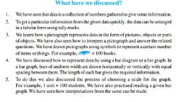
January, February, March, April, May, , 560, 720, 600, 450, 820, , Solution:, To draw the bar graph for the given data, we proceed as follows:, , , , , , , Draw two perpendicular lines, one vertical and one horizontal, Mark the months along the horizontal line and mark the corresponding number of bikes along, the vertical line., Draw bars of same width and maintain uniform gaps between them., Choose a suitable scale along the vertical line. Let 1 unit length = 100 bikes sold and mark the, corresponding values., , Hence, the bar graph of the given data can be drawn as:, , , , We can interpret a bar graph by reading and analyzing it., For example, the given bar graph represents the population of a small town in, four consecutive years.
Page 6 :
We can analyze the given bar graph and answer the following questions., 1., 1., , What is the population of town in 2010?, Solution: The population of town in 2010 = 1,00,000 × 7 = 7,00,000, 2., , In which year was the population of town maximum?, Solution: Population of town in 2007 = 1,00,000 × 4 = 4,00,000, Population of town in 2008 = 1,00,000 × 6 = 6,00,000, Population of town in 2009 = 1,00,000 × 7 = 7,00,000, Population of town in 2010 = 1,00,000 × 9 = 9,00,000, So, population of town was maximum in 2010., , 3., , By how much does the population increased from 2007 to 2010?, Solution: Difference between the population of 2010 and 2007 = 9,00,000 –, 7,00,000 = 2,00,000, So, population of the town is increased by 2,00,000 from 2007 to 2009.


